Design system 104: Making metrics matter


Behind every successful design system lies a surprising secret: numbers. Learn how tracking the right metrics can transform your design system from a helpful resource into a powerful engine for efficiency.
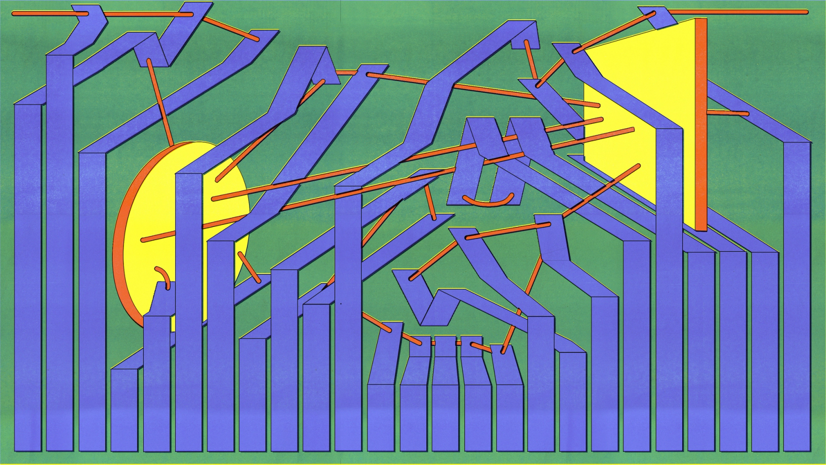
Artwork by Cynthia Alfonso
Beyond the substantial time savings, the experiment uncovered a qualitative benefit: Participants reported greater confidence in their designs when using a design system, knowing they aligned with the overall product.
The data speaks for itself: Figma’s data science team found that designers with access to a design system completed tasks 34% faster than those without. To put this in perspective, consider a team of seven product designers, each with 20 hours of focused design time per week. With a 34% efficiency boost from a design system, it’s like adding 3.5 designers to the team every week. At companies like Vanguard, where design updates are 50% faster with proper systems in place, these gains compound dramatically.
With a 34% efficiency boost from a design system, it’s like adding 3.5 designers to the team every week.
While teams often focus on creating components and documentation when first building a design system, measuring adoption and usage reveals the true business impact. Companies like Headspace have seen 20%–30% time savings on straightforward tasks and up to 50% on complex projects through their use of tokens and variables, while Swiggy cut feature rollout time in half after implementing robust tracking. These metrics illuminate clear paths to improved consistency, efficiency, and scalability.


Welcome to part four of our introduction to design systems. If you missed our previous articles check out What is a design system?, How to build your design system, and Documentation that drives adoption.
Reading the signals
In design systems, there are usage metrics, adoption rates, consistency scores, and other performance indicators. But, which are the right ones for your organization? The number of times components are utilized or design tokens are applied can provide insight into which parts of your design system are the true workhorses. And then there’s time—precious time saved due to component reuse, a quantifiable benefit that wins over stakeholders and teams alike.
Key metrics to consider tracking include:
- Library and component usage: Monitor which components, variables, and styles see the most use—and which don’t. This data helps identify opportunities to improve or deprecate underutilized elements.
- Documentation effectiveness: Track how teams interact with your documentation. Popular pages and common search queries can reveal where teams need the most guidance.
- Consistency measures: Look for patterns in component detachment or style overrides that might signal areas where the design system isn’t meeting team needs.
For Veronica Agne, Senior UX Designer at athenahealth, component detachment rates offer particularly valuable insights: “If someone in our organization is detaching a component, I want to know why,” she explains. “It can mean one of three things: There’s a bug, people want an enhancement to the functionality that isn’t there, or people are combining existing elements in ways I didn’t expect. I care about all three of those answers.”
This detective work recently paid off when Veronica noticed an uptick in detachments for a container component. “We had a little auto layout issue where it wasn’t wrapping the way we needed it to,” she recalls. “I saw a bunch of people detaching it and realized that was likely why. I didn’t have to wait for someone to specifically tell me it was a problem before I could fix it.” After working in data science and analytics and now leading design for athenahealth’s Forge design system, Veronica brings a unique perspective to measuring the success of a system that operates at scale—serving hundreds of designers, developers, and product managers, with around 100,000 component insertions per month.
Leveraging tools and automation
Consistency scores and accessibility compliance serve as vital signs of a design system’s health. By treating monitoring as part of an ongoing routine—rather than a periodic checkup—you’re more likely to catch potential issues before they escalate. Automation can free teams to do what they do best—design and innovate—rather than getting bogged down with the minutiae of data tracking. With plugins, build scripts, and testing frameworks, manual tasks give way to efficiency and precision.
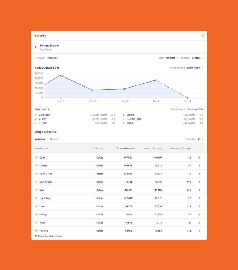
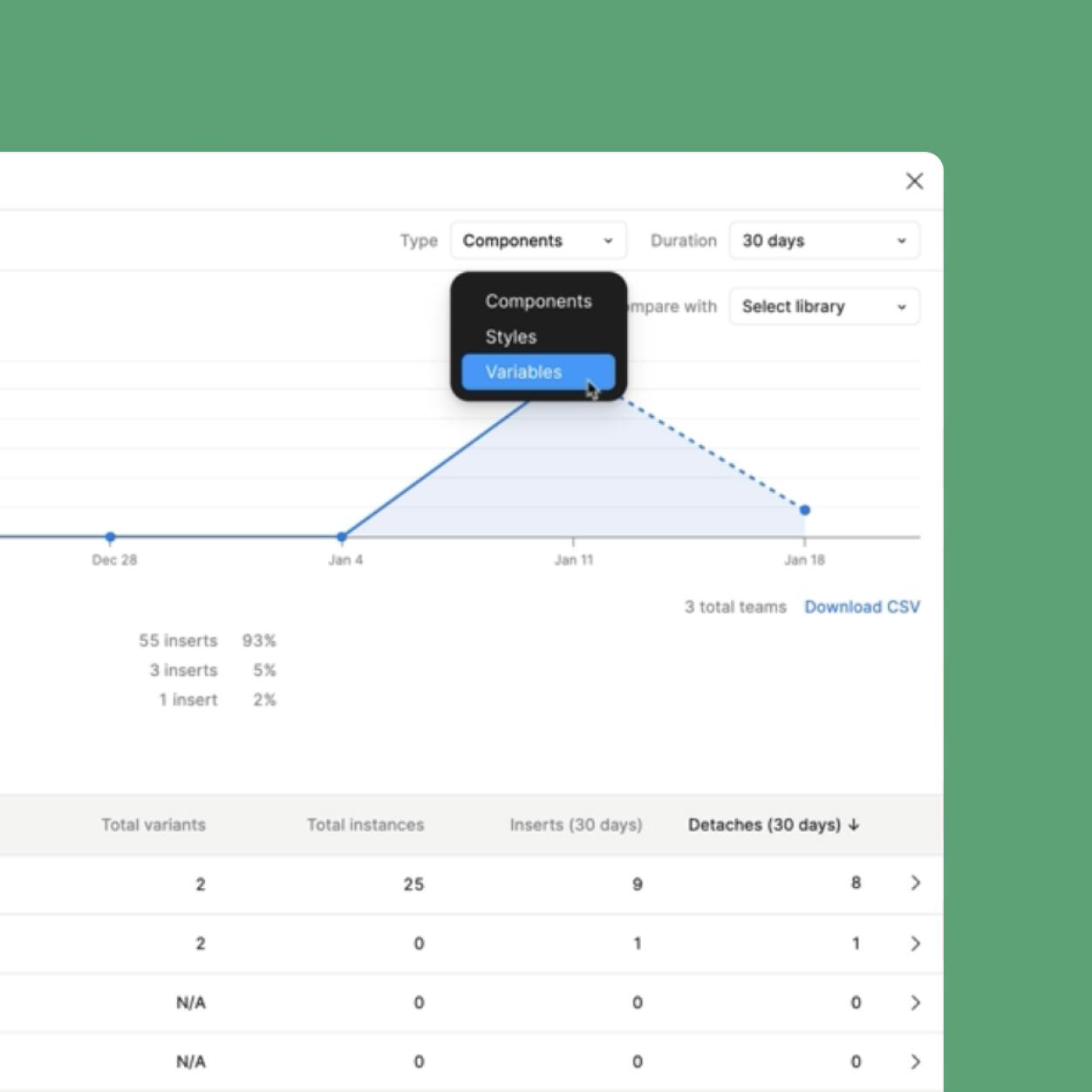
Starting February 11, 2025, Figma’s updated Library Analytics give Organization and Enterprise customers deeper insights into how their published libraries are being used without leaving their design environment. Teams can now track adoption of variables and styles, in addition to the existing component analytics, directly within Figma, making it easier than ever to understand design system usage across their organization. Library analytics include:
- Components: Monitor usage patterns and identify which elements teams use most
- Styles: Track how color, type, and effect styles are implemented across files
- Variables: Understand how tokens and dynamic properties are leveraged
For Enterprise customers, the new Library Analytics API provides even more flexibility to customize analytics views. Teams can see usage patterns over specific timeframes, combine different types of data, and integrate design system metrics with their existing tools and workflows.
Making data actionable
At athenahealth, Veronica and her team have been some of the first to try out Figma’s latest Library Analytics additions, leveraging it as part of their process for turning metrics into improvements. “I use Figma’s updated library analytics to have more fine-grained control over seeing how, when, and why people are detaching components,” she explains. Her team uses custom scripts to transform the API data into detailed reports, adding context like component types and expected detachment rates, then visualizing and reviewing it monthly via a Tableau dashboard.
This data then drives a three-step process:
- Diagnostics: Examining components for obvious issues
- User outreach: Connecting with teams to understand their needs
- Implementation: Creating tickets for necessary improvements, whether in Figma or code
“We’re constantly trying to make sure there are no problems in our design system,” says Veronica. “People aren’t going to report every issue they have. If I have another metric that can point to an issue, I don’t need to rely on people’s willingness to tell me something is wrong.”
At Squarespace, the design systems team leverages the compare libraries filter to track migration between different versions. This allows them to monitor usage between old and new iterations, and ensure older versions are properly deprecated.
Microsoft also uses design systems analytics as a form of feedback. “There are so many teams at Microsoft using the Fluent Design System, and we don’t always get feedback from them about what’s working and what’s not,” says Microsoft’s Damien Aistrope, previously Principal Designer on Fluent. “So it’s helpful for us to see which components aren’t being used and not important to maintain, as well as which components are often detached and may need updating.”
There are so many teams at Microsoft using the Fluent Design System, and we don’t always get feedback from them about what’s working and what’s not.

Best practices for measuring impact
Model learning is a process of constructing and training computer programs to recognize patterns, make predictions, or understand behaviors from data.
For teams looking to start or improve their metrics tracking, Veronica suggests taking a historical approach: “Take a backwards look before trying to take a forwards look. Using Library Analytics, you can go back a year and examine what happened during a period where you already know the outcomes. It’s almost like model learning—you can look at what might have pointed to those outcomes and use that to identify what to look for in the future.”
Using Library Analytics, you can go back a year and examine what happened during a period where you already know the outcomes.
While the benefits of tracking metrics are clear, the process does come with challenges, such as maintaining data quality, gaining stakeholder buy-in, and translating insights into action. Other best practices include:
- Measure early and often: Don’t wait until after launch to start tracking metrics. Early measurement helps identify adoption barriers and opportunities for improvement before they become systemic issues.
- Set clear goals aligned with business objectives: Tie metrics to specific outcomes. Are you trying to increase adoption? Improve consistency? Reduce design debt? Your goals should inform which metrics matter most.
- Look beyond surface numbers for context: A high detachment rate isn’t always negative—it might indicate a component designed for customization is working as intended. Context matters.
- Share insights broadly with stakeholders: Build support for your design system and demonstrate its impact on efficiency and consistency by sharing out metrics.

Learn more about Figma’s updated Library Analytics for Organization and Enterprise teams.
Planning for scale
As your design system matures, your approach to metrics should evolve, too. Regular review of your metrics strategy ensures you’re tracking what matters for your current stage of development. Consider segmenting data by team or product to gain more granular insights. This can help identify where additional support or customization might be needed.
Remember that metrics are a means to an end: They should help you build a more effective, widely adopted design system that makes your team more efficient and your products more consistent. Use these measurements to guide improvements, demonstrate value, and ensure your design system continues to meet the evolving needs of your organization.