Figma on Figma: How we built our website design system


A look at how the Figma marketing team built, and continues to build, the design system for figma.com
Note: This post was originally published on designsystems.com. It has been updated and republished here


Read how we most recently updated our web design system using Figma’s latest features. Here’s a behind-the-scenes look at how we streamlined our components, improved our workflows, and built for the future.
At Figma, we think design systems are a powerful tool to help democratize and empower entire organizations to be a part of the design process. They enable consistency at scale and help teams deliver better products, faster. But what product design teams have been learning and adopting in terms of design systems has not been as quick to catch on when it comes to marketing and web design.
As the newly joined marketing web producer, I began to dissect the pages on our marketing site as well as the process for creating new pages. I realized that we severely lacked the consistency and rigor that we believe to be a best practice for web design. Instead of a repeatable method for building pages and a library with reusable elements, designers and developers were coming up with their own systems and creating brand new solutions, many of which were very similar, though not exact, to solutions already implemented on other pages. Not only was the marketing site difficult to maintain and update, it felt inconsistent for our users. It was time to build a system.
Taking inventory
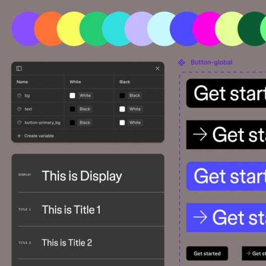
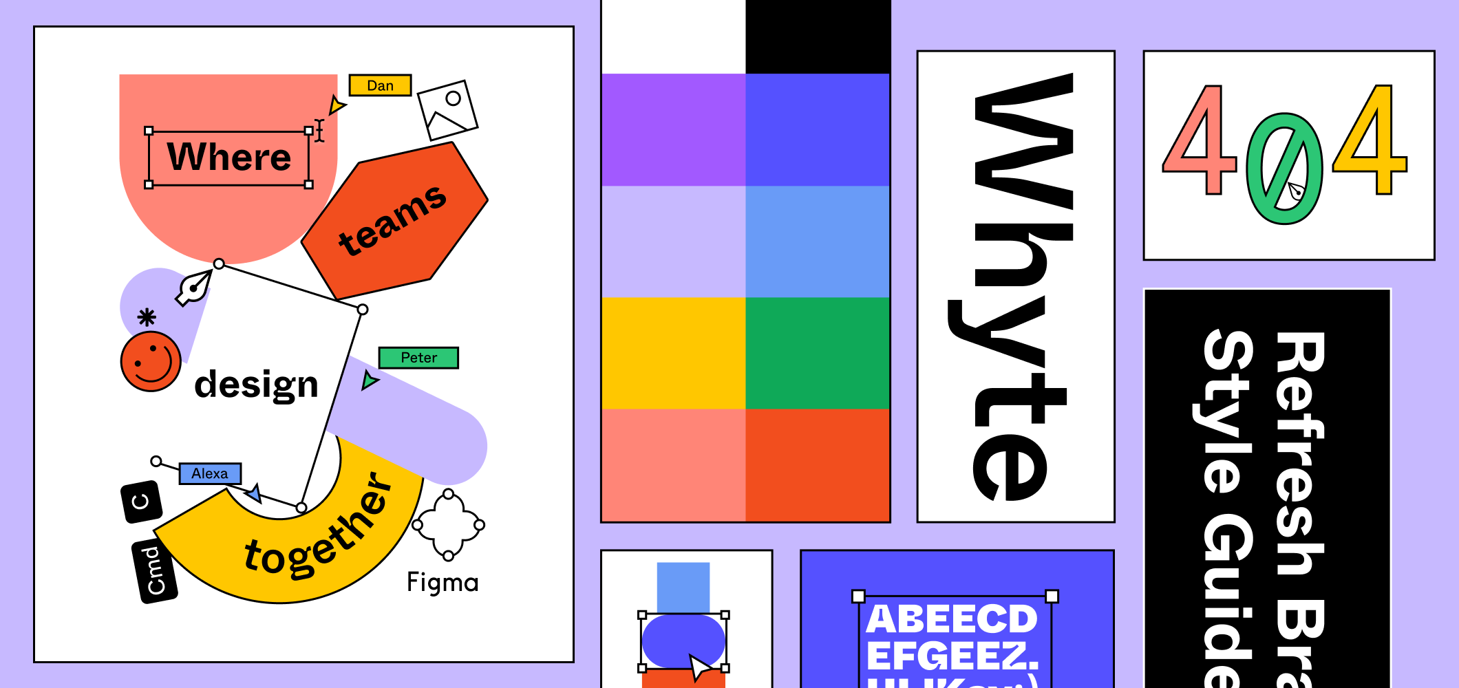
Our first step was to take stock of what we had – fonts, sizes, colors, column widths, layouts, and so on. We started compiling all of that information into a Figma file, and from there, it was easy to see overlaps, or in other words, repeated applications of patterns that just needed to be unified. We also spotted the outliers, or those components that had been used only once, and therefore didn’t have a place in our style guide.
Some of the repeated elements were quite large, so we dissected them down to an atomic level, which would allow anyone using the design system to then piece the atoms and molecules together to form organisms that fit the needs of any page and the content that needed to live there. It was very important for us to end up with flexible building blocks that could work in conjunction with one another in any combination.
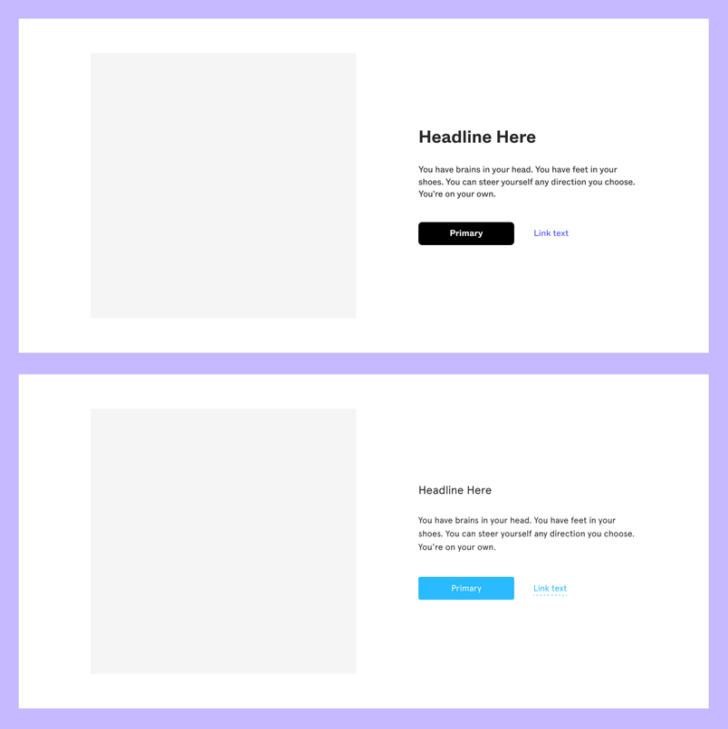
We also looked for elements that were similar, but not exactly the same, and agreed on one style. So, instead of 12 different sizes for headings, we established an H1-H3, body copy, and technical copy styles. We did the same for our blog and other long form content, adding styles such as pull quotes and block quotes.
Once we interpreted and refined the visual language we’d already created, it was a pretty simple exercise to organize all the components in a shared library so that a person with little design experience or familiarity with Figma’s brand could create something that looked and felt cohesive with the rest of our site.
A simplified, flexible design system
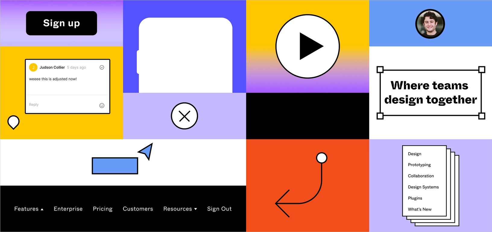
Over the course of a month, our small team created and organized a robust, adaptable style guide and component library that now lives in our CMS, Contentful. Everything is consistent across the board—typography, sizes, padding, line heights, colors, and grid. Now, when the design team goes to create a new page, they’ve got flexible building blocks right at their fingertips. Building an H1 is as easy as grabbing it from the design system. We’ve also begun to “componentize” commonly paired elements and fully assembled sections using the elements from our system. We call these larger organisms “FLEGOs” (Figma + LEGO) and you can check them out in this public file.
Getting to market faster
The majority of Figma’s core marketing site is now built with this framework. Using our design system through Contentful, we can go from concept to ship in one day and can do that without the need for any new code. For example, when we wanted to create a What's New page, the product marketer who originally had the idea and I made a quick wireframe using the FLEGOs, collaborated on the copy directly in the Figma file, and then built out the page using the components in our CMS. We went from idea to a live web page in less than 48 hours.


Additionally, when we want to make a universal change to an atom or molecule, we can do it once in Contentful, rather than getting a developer to hunt through every page to make dozens of updates directly. Recently, we refreshed our brand From typography to colors to illustration, the Figma brand has evolved. 
Bringing new life to Figma’s brand

An ongoing evolution
We’ve already been able to rely on our design system for some big projects, but we’re still revising and modifying as we go, and expect this will always be the case as we encounter new reasons to add components to our library or modify what exists. We have work to do regarding accessibility and that is something we are prioritizing.
There are also times when we break out of the system. For example, we wanted to capture a visitor’s attention right away on our homepage, so we opted for larger, centered headline that is animated. There are no other sections like this on our site and therefore this is not part of our design system.
Whenever we find ourselves straying outside of the system we’re careful to justify why, and also to investigate the likelihood of that same decision being made in the future. If there’s a good chance we might use it again, it’s a compelling reason to add it to the system.
Start your own system
Trying to organize and advance your own system? Here is the file that governs Figma’s marketing site system as well as a blank template to get you started:
- FLEGOs: The building blocks of our marketing site that are made from the atoms and molecules in our design system.
- Style guide starter template: A sample template you can use to get started with your own style guide.
Andrea Helmbolt is a Brand Strategist on Figma's Brand team. Previously she was a manager on the Web Marketing team and, before that, a Senior Web Producer.